Today I am pleased to welcome the designer of V.E. Schwab’s latest book, A Darker Shade Of Magic, Julia Lloyd, and the author herself, Victoria Schwab, to discuss the journey to the fabulous cover shown below, as part of the blog tour.
JL: Following on from the great response we got for the cover design of Victoria’s 2014 hit Vicious, designed for Titan Books by Amazing 15, I wanted to continue with the strength of the colour palette used there. A Darker Shade of Magic is the first in a new fantasy series about a magician who uses blood magic to move between four different Georgian Londons – which are grey, red, white and black, so this colour palette was very suitable.
I also researched typefaces from the era, circling around Bodoni and Caslon: two very of-the-period serif fonts that I used for the basis of the final lettering.
VS: I was such a fan of the bold color palette on VICIOUS (and you didn’t even know that red, black, grey, and white would prove to be so important) and the fact that ADSOM continues the trend is so cool. It feels like an extra layer of branding, and since I’m a pale redhead who wears all black, it’s a perfect addition ;)
VS: I was such a fan of the bold color palette on VICIOUS (and you didn’t even know that red, black, grey, and white would prove to be so important) and the fact that ADSOM continues the trend is so cool. It feels like an extra layer of branding, and since I’m a pale redhead who wears all black, it’s a perfect addition ;)
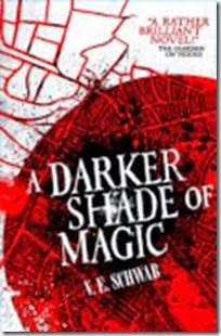
JL:These were the only other concepts that I did (apart from that which became the finalised cover), as the design was approved extremely swiftly in comparison to most projects. The first one is a more literary approach where I experimented with form and texture to portray the different dimensions of London. Whilst this was viewed favourably, it was felt that the sense of movement and travel – through the four Londons – was lost and this approach would be best suited to another novel. We then looked to the second concept, which maintained the circular theme that can be seen on the Vicious cover. This design incorporated the geography of London with the roads representing veins (our main character, Kell, uses his blood to open the portals to each London). This approach was discarded as we felt a similar concept had been done on Rivers of London and again did not portray enough of a sense of movement.
VS: Oh wow, this is my first time seeing these, but they are SO cool. I’m a fan of the one on the right, because as you pointed out, the trailing street lines look like blood/veins, and it’s a fairly violent book. And I didn’t even notice at first glance that it mirrored Vicious. But I also totally agree that it’s too close to the Rivers of London covers, a problem my US designer also ran into!
VS: Oh wow, this is my first time seeing these, but they are SO cool. I’m a fan of the one on the right, because as you pointed out, the trailing street lines look like blood/veins, and it’s a fairly violent book. And I didn’t even notice at first glance that it mirrored Vicious. But I also totally agree that it’s too close to the Rivers of London covers, a problem my US designer also ran into!
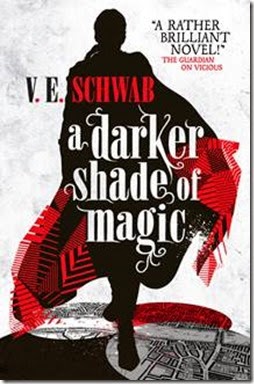
JL:Which brings us to the third concept – the final design. We see not only the figure, which gives a strong focus point and panel for the typography, but also the multi-dimensional coat. Such a clever device in the book, I was really pleased to be able to include it on the final cover. The coat offers a real sense of movement, which is palpable when you see this figure – which can be Kell, but who’s to say it’s not Lila?! – stepping over the various shaded maps, cape bellowing behind. I really hope that you, as I do, get a sense of the pace of the book , which quickly caught me up in its pages. A gem to read and to work on.
VS: The coat. The coat. The coat. Anyone who’s read my books knows I have an unhealthy obsession with fanciful outerwear, and the fact you not only captured the sense of movement but the epic glamour of Kell’s multisided coat just seals this for me. And haha, maybe Lila will be the focus of the second one ;) I also LOVE the fact that he’s stepping on the four Londons. The US cover features a bird’s eye view of this same action, and the idea of seeing that movement from two different angles, in two very different ways, makes this the perfect cover. Thank you so much.
VS: The coat. The coat. The coat. Anyone who’s read my books knows I have an unhealthy obsession with fanciful outerwear, and the fact you not only captured the sense of movement but the epic glamour of Kell’s multisided coat just seals this for me. And haha, maybe Lila will be the focus of the second one ;) I also LOVE the fact that he’s stepping on the four Londons. The US cover features a bird’s eye view of this same action, and the idea of seeing that movement from two different angles, in two very different ways, makes this the perfect cover. Thank you so much.
A Darker Shade of Magic is published by Tor Books on the 24th February. Look out for my review later this week.
To find out more about VE Schwab:


No comments:
Post a Comment
Hiya, thanks for stopping by, it is always nice to hear what you have to say, so do leave a comment if you have time.